


Landing pages are often the front line of your brand. They’re where interest turns into action, where story meets strategy, and where visitors decide whether to stay or bounce. This is why brand messaging matters.
At Studio North, we believe a good landing page does more than just look the part. It works hard. It earns attention. It builds trust. It converts.
Here’s our take on what separates the forgettable from the powerful. It’s shaped by real-world experience, performance insights and a relentless drive to create breakthrough branding.
1. Clarity always comes first
Your landing page should clearly communicate your brand’s offer and the problem it solves. If people don’t know what you do within seconds, you’ve lost them. Start with the outcome, then frame the challenge. Let visitors see themselves in the solution.
Landing pages with a clear value proposition convert around 34% better than those without¹.
2. Align to your brand proposition
This is not just a sales page. It’s a brand moment. Everything from headline to visual style should connect directly to your core proposition. If your landing page doesn’t reinforce what sets you apart and why you matter, it’s a missed opportunity. A strong landing page echoes the central idea that drives your brand forward.
3. Design is your first impression
People judge brands on how they look. A professional, well-crafted visual design sets the tone and builds trust. It’s not just aesthetics. It’s credibility. The way you look shapes how you’re perceived.
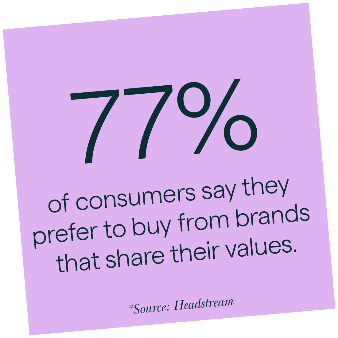
4. Build trust through values
Audiences don’t just buy into what you do. They buy into why you do it. Your landing page should reflect your brand values in tone, language, imagery and structure. Whether it’s warmth, innovation or integrity, those values help create deeper emotional connection. 77% of consumers say they prefer to buy from brands that share their values.
5. Storytelling or straight-talking?
Both have a place. For e-commerce or simple propositions, direct messaging cuts through. For service-led businesses, a more narrative-led approach can help articulate value, frame the problem, and build persuasion. If you brand messaging is well crafted this is where it will start to have an impact.
When consumers connect with a brand story, 55% say they’re more likely to make a future purchase2.
6. Consistency is everything
Consistency isn’t about playing it safe. It’s about building recognition and trust. Every visual element, every message, every touchpoint should feel unmistakably yours. Yet 71% of organisations admit that inconsistent branding causes market confusion3.
This is the cost of not joining the dots. Consistency is what keeps your message clear and your reputation intact.
7. Craft calls to action with care
CTAs must be crystal clear. Too soft and they lack impact. Too forceful and they create hesitation. The sweet spot lies in confident, inviting language that makes the next step feel like a natural move, not a leap of faith.
8. Use animation and video wisely
Motion should support key messages, not steal the limelight. Used well, it adds richness and energy. Used poorly, it distracts or slows the page. Keep it simple and purposeful.
9. Above-the-fold isn’t everything
Yes, your call to action should be visible early. But you don’t need to cram it all into one screen. Instead, give users a reason to scroll. Hook their interest, then guide them deeper.
10. Lead with the outcomes, then explain how you deliver them
Begin by showing the desired result. From there, build a compelling case with benefits, features, and social proof. Testimonials, real names, even trust platforms like Trustpilot, this kind of external validation works wonders.
11. Showing the price or creating intrigue
There’s no one-size-fits-all. In some cases, transparency helps convert. In others, it deters. The right approach depends on what your audience expects and what’s needed to encourage them to take the next step and enquire or buy.
12. Speak to someone, not everyone
Trying to target everyone usually ends up resonating with no one. The more focused your message, the more compelling it becomes. If you must appeal to multiple audiences, your messaging needs to flex with intent.
13. Don’t let SEO dilute clarity
Search engines bring traffic. But clarity drives conversions. A page overloaded with keywords may rank well but struggle to convert. Strike a balance between optimisation and persuasion.
14. Ask for the data you need, not the data you want
Ask only what you absolutely need. For downloads, an email might suffice. For enquiries, maybe a name and message field too. Don’t make users jump through unnecessary hoops.
15. Build trust in every corner
Client logos, accreditations, awards and reviews are all trust signals. Use them boldly, especially if they carry weight. They are often the proof your words alone can’t provide.
16. Use images with intent
Authentic, people-focused imagery connects. But it must align with your brand and message. Aim for images that represent the outcome you’re promising, not just generic stock shots.
17. Design for every screen and context
Responsiveness isn’t enough. True mobile optimisation means rethinking structure and flow to deliver the best experience for the screen someone is actually using.
18. Tone of voice matters more than ever
Your brand’s tone should carry through, but it needs to adapt for clarity. Break your copy into digestible chunks to make a page easy to digest. Be succinct, but never dull.
19. Testimonials that are real feel real
Quotes with faces, names, roles and ideally external validation carry more trust than polished scripts. Case studies or even short video clips add depth. But don’t fake it. Audiences can tell.

20. Balance impact and performance
A stunning page that doesn’t load quickly will lose visitors. But a fast page that’s visually underwhelming may miss its chance to impress. You can and should find the balance.
21. Accessibility is good for everyone
Good contrast, readable text, clear structure and navigability aren’t just box-ticking. They’re good UX for all. Accessibility should be baked in, not bolted on.
22. Review, refine, repeat
Landing pages aren’t set-and-forget. Use metrics to guide updates and experiments. But when your brand evolves, your landing pages must too. That’s your moment to reframe and re-engage.
23. Don’t leave users stranded
Hiding navigation can boost conversion, but at what cost? Sometimes users just want to explore. Always give them a way to find your homepage, even if the top nav is removed.
How to stick the landing
A good brand landing page isn’t just a sales tool. It’s a brand expression. It should reflect your proposition, express your values and deliver clarity with confidence. This is where trust is built, action is taken and decisions are made.
And if you’re looking to sharpen your brand and create high-performing landing page experiences, we know a team that can help, let’s talk
Sources
¹ Invesp (2024). Landing Page Statistics: 34% conversion lift for clear value propositions, 2 Headstream (2015). Brand Storytelling Report, 3 Lucidpress (2017). State of Brand Consistency