A brand’s online presence is more important than it has ever been. With a significant shift to digital marketing spend, a company’s website is often the destination that needs to play a big part in conversion or sales. And, with content marketing making up an average of 25 to 30% of marketing spend, providing a good experience when your target audience reach the site is critical.
What makes for an excellent online experience?
A good online experience will help users find what they need quickly, navigate the site easily and present information clearly. However, an excellent online experience will provide little moments of delight that a user will notice, remember, and elevate your site above your competitors. As an agency that focuses on the importance of the brand experience online, we understand that this experience should reflect your brand’s personality.
Should your site’s experience be fun and humorous or serious and authoritative? When is it appropriate to use animation to help convey information or highlight content, and when is it inappropriate? When balanced correctly, animation and video can enhance a users experience, and video, in particular, is a great way to convey a lot quickly.
Can there be too much of a good thing?
Back in the days of Flash, some websites took playfulness to the extreme. Everything was possible, and many sites wanted to push the boundaries. For some sites, this level of immersion and interactivity was very appropriate. Game and film sites provided an escape, and exploration was part of the fun. But there were other sites where this playfulness and complexity hindered the site’s main goals and navigation. The experience wasn’t fun, and it became a barrier to the content the users were looking to find. Flash content also wasn’t responsive, and the rise of mobile browsing meant that users required a more flexible delivery of rich media content.
In 2010 Steve Jobs wrote an open letter titled “Thoughts on Flash”. In this letter, he concluded that Flash was no longer required to provide immersive site experiences and that open standards such as HTML 5 would pave the way forward. This was a bold move from Apple, and it forced an industry shift away from Flash and towards the open standards of HTML 5. Adobe officially discontinued support for Flash at the end of 2020, and all Flash content was blocked as of 12 January 2021. In many ways, it was a sad day; Flash sites were a lot of fun and played a big part in my love for design and websites. But in many other ways, the web has grown up, and user experience has become more of a focus than just the experience.
Enhancing the online experience
Video content
Video is a potent medium to deliver content and tell a story. Combining strong visuals with audio is a dynamic way to convey a brand message or simplify a technical process. With HTML 5, embedding content has never been more straightforward. YouTube and Vimeo both allow videos to be embedded simply with the complexities of streaming all handled by their platforms. We highly recommend Vimeo because it enables you to tailor the player controls and even utilise your brand colours in the player, as we have done in the example below.
TransPennine Express video
You can view some of the other ways we’ve used video here.
Animation
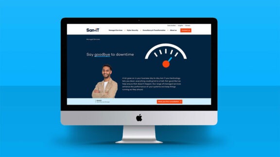
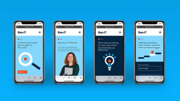
Animation can help provide an element of playfulness and help communicate information to a user in a simple way. We’ve used Lottie animations which provide a crisp vector animation that can interact with page scrolling or triggers. On the San-iT homepage, we trigger animations at different parts of the page as they come into view; the clock (which is below) plays frames of the animation as you scroll, which is an excellent way to provide that moment of delight and also works to slow the user down as they realise what’s happening. We also use animation to draw attention to the NPS score.
Lottie animations can often provide smaller file sizes than GIFs that are smoother and scalable too. There are many ways to utilise Lottie animations, and they can be a great way to help tell a story as a user scrolls down the page.
CSS provides another option for animation. We’ve utilised this on the b-gen.co.uk website to animate in frames around headers and employed a rollover effect for menus. These animations are quick and not disruptive but add an element to the experience. An arrow animation at the base of the website swivels to point towards the call to action, which is used consistently across the site to draw additional attention to call to actions to help guide the user.
Crafting your brand’s online experience
It can be easy to get carried away when introducing animation or video content to your site. The most important question to ask is will this add to the users’ experience and how can it best be used to support the message or content you are looking to deliver.
A quick, eye-catching animation can help draw extra attention to a call to action, or a timed animation can help convey how much of an article a user has read, such as we’ve done here for San-iT. At all times, the experience should align with your brand’s values and convey the brand’s personality.
We’re excited about the possibilities that new technologies will enable. As long as technology is being used to enhance rather than replace the message you’re looking to deliver, we’re all for it.
If you’re looking to engage with a branding agency to help you create a compelling online experience for your brand, we’d love to hear from you.
